border-radius 基本语法:
border-radius : none | <length>{1,4} [/ <length>{1,4} ]?取值范围:
<length>: 由浮点数字和单位标识符组成的长度值。不可为负值。
如果你在 border-radius 属性中只指定一个值,那么将生成 4 个 圆角。
但是,如果你要在四个角上一一指定,可以使用以下规则:
- 四个值: 第一个值为左上角,第二个值为右上角,第三个值为右下角,第四个值为左下角。
- 三个值: 第一个值为左上角, 第二个值为右上角和左下角,第三个值为右下角
- 两个值: 第一个值为左上角与右下角,第二个值为右上角与左下角
- 一个值: 四个圆角值相同
接下来通过实例了解border-radius具体用法:
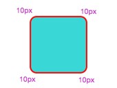
一:border-radius只有一个取值时,四个角具有相同的圆角设置,其效果是一致的:
.demo1 {
width: 80px;
height: 80px;
background: #3ad7d7;
border: 2px solid #ff0000;
border-radius: 10px; /*4个角的值相等*/
} 
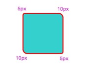
二:border-radius有二个取值时,左上角和右下角相同,右上角和左下角相同的:
.demo2 {
width: 80px;
height: 80px;
background: #3ad7d7;
border: 2px solid #ff0000;
border-radius: 5px 10px;
} 
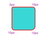
三:border-radius有三个取值时,此时左上取第一个值,右上等于左下并且他们取第二个值,右下取第三个值:
.demo3 {
width: 80px;
height: 80px;
background: #3ad7d7;
border: 2px solid #ff0000;
border-radius: 5px 10px 15px;
} 
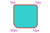
四:border-radius设置四个值,此时左上取第一个值,右上取第二个值,右下取第三个值.左下取第四个值:
.demo4 {
width: 80px;
height: 80px;
background: #3ad7d7;
border: 2px solid #ff0000;
border-radius: 5px 10px 15px 20px;
} 
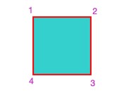
方便理解记忆 :
如下图,从左上开始1,2,3,4,四个角。不管是几个值,从1开始对号入座,没有值的取对角值,当然1个值的时候就4个角都相等,这样不论水平半径和垂直半径是否相等,都可以很好的理解,不容易出错。
接下来看看细分了水平半径和垂直半径的情况:
先来个小demo吧----
.demo5 {
width: 80px;
height: 80px;
background: #3ad7d7;
border: 2px solid #ff0000;
border-radius: 20px / 40px;  /*水平半径/垂直半径*/
} 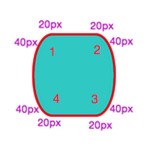
可以看到,水平和垂直半径的值分开设置了,不再一样,还是可以1,2,3,4对号入座,只是水平和垂直半径分开了而已。
20px / 40px 斜杠‘/’前面的是水平半径的值,后面是垂直半径的值。同样,每个角的水平和垂直半径也可以分别设置成不一样的。
.demo6 {
width: 80px;
height: 80px;
background: #3ad7d7;
border: 2px solid #ff0000;
border-radius: 10px 20px 15px 30px / 40px 5px 30px 10px;  /*水平半径/垂直半径*/
} 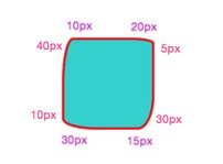
每个角都设置了不同的水平和垂直半径。不管怎么设置值,都可以从左上角开始一一对号入座,没有取到值的,就取对角的值。
现在可以大开脑洞,设置不同半径,制作特殊的图案了,这里就不费篇幅一一列出来了。
用border-radius画圆
先来demo---
1.无边框的圆形
.demo7 {
width: 80px;
height: 80px;
background: #3ad7d7;
/*border: 2px solid #ff0000;*/
border-radius: 40px;
} 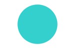
不带边框的圆,只需宽和高相等,border-radius为宽高的一半就可以了。
2.有边框的圆形
有边框的圆,就需要把边框的宽度也考虑进去。先来个反例:
.demo8 {
width: 80px;
height: 80px;
background: #3ad7d7;
border: 5px solid #ff0000;
border-radius: 40px;
} 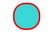
可以看到,忽略了边框的宽度,只设置border-radius为宽高的一半,出来的就不是圆了。
再看一个考虑了边框的demo
.demo9 {
width: 80px;
height: 80px;
background: #3ad7d7;
border: 5px solid #ff0000;
border-radius: 45px;
}
效果:
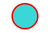
结果就显而易见了。所以在画圆的时候还要注意有无边框。
最后附上一个小demo。
<!DOCTYPE html>
<html>
<head>
    <style>
        body        {
            margin:30px;
            background-color:#ffffff;
        }

        div.polaroid        {
            position: relative;
            top: 50%;
            left: 50%;
            width: 16px;
            height: 16px;
            background-color: white;
            animation:localShine 2s linear infinite;
            border-radius: 8px        }

        @keyframes localShine{
            from {
                box-shadow:0 0 0 0 #E6E6E6;
            }
            to {
                box-shadow:0 0 0 6px #cbcbcb;
            }
        }

    </style>
</head>
<body>

<div class="polaroid">
</div>

</body>
</html>
效果:

http://www.virplus.com/thread-147.htm
转载请注明:2019-2-26 于 VirPlus 发表